


Bo's Rooms Part Two
His Studio
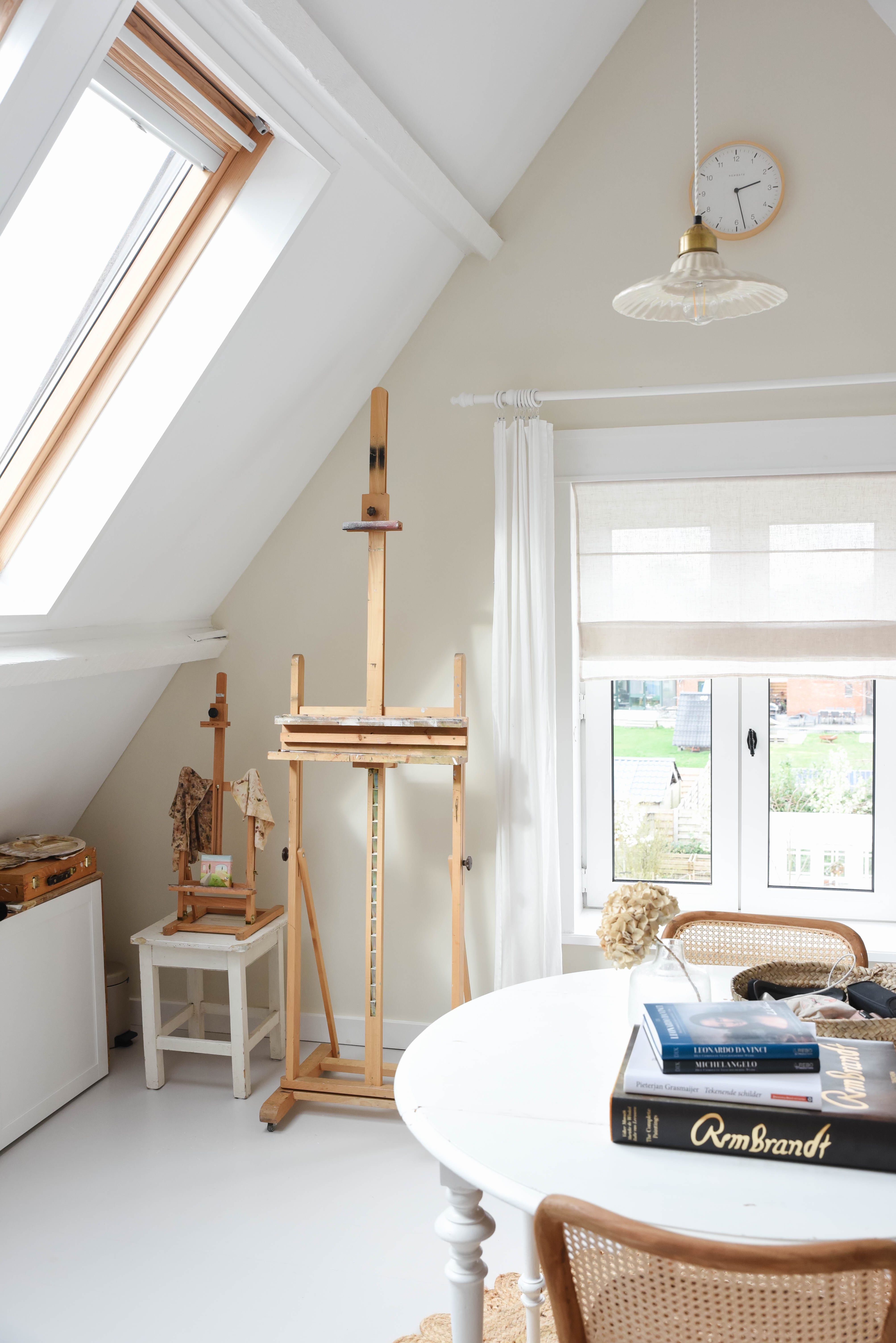
Today the second part of “Bo’s rooms” his art studio. For those who are new here, welcome, Bo (who’s full name is Boris) is a portrait painter, decorative painter and high end decorator - all three together pay his bills. I took these photos on a day that all commissioned work just left the studio to their new owners so it’s unusually empty but it’s as usually tidy as Bo is a really neat painter. He uses oil paint on fine portrait linen or wood so he hardly spatters and he doesn’t really need a lot of space.
This is what the room looked liked when we bought the house. We’ve painted everything white, like in the other room, but we didn’t use wallpaper as Bo wanted a clean room without too much fuss. Also the south facing wall is covered in books so they form a way of a wallpapered wall. The north facing wall is painted in Farrow & Ball School House White.
Bo's Rooms Part One

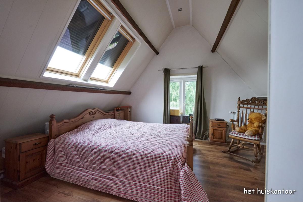
The two main reasons we fell in love with our home was the Dutch clock-shaped facade and the attic. It’s not really an attic but more a third floor. The space is divided in two rooms, one facing south and the other one facing north. As Bo and I don’t share bedrooms he claimed the whole attic, sleeping in the south facing room and painting in the north f…
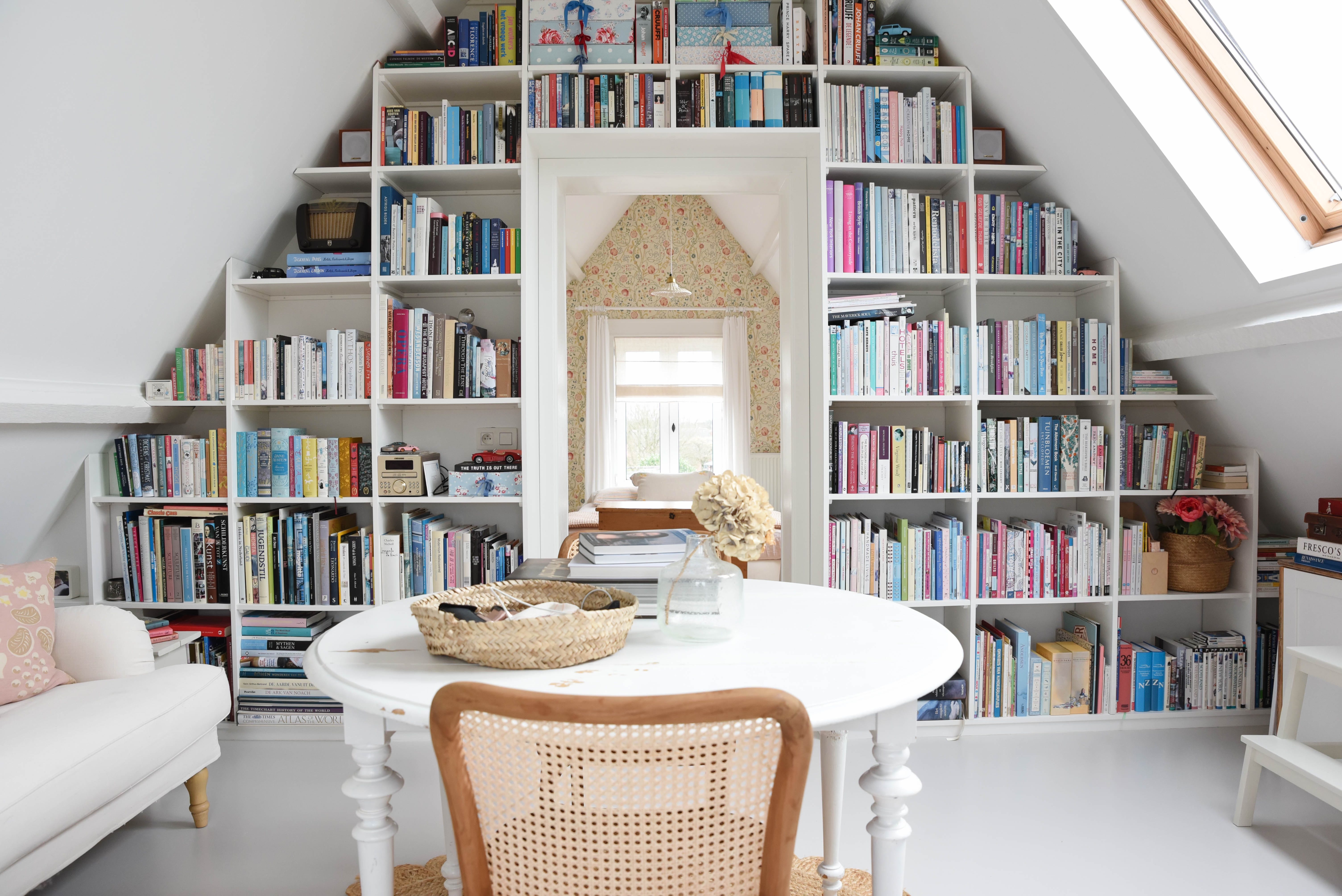
I knew straight on that the main bookcase of the house (we have quite a few) should be on this wall in the attic. We’ve used simple MDF panels and went along with the curves and shapes of the ceiling. It holds our art, craft, interior, travel and gardening books and a few novels that we hold on dear. But also keepsake boxes, vintage miniature cars and Bo’s mum’s old radio.


I find it always so interesting to see how people use colours and wallpapers to decorate a room. For example the Morris & Co. Mary Isobel Wallpaper I’ve used for the attic, I went for the yellows and pinks in the wallpaper. My friend (who also has this wallpaper in her deli) went for red and I saw someone on Instagram using the blue that’s in the flowers. To add a splash of colour to this room I’ve sewed cushion covers using a Bloomsbury print that Duncan Bell designed in 1935. You used to be able to buy it at Charleston but it’s been on backorder for ages. You can still buy the yellow version.
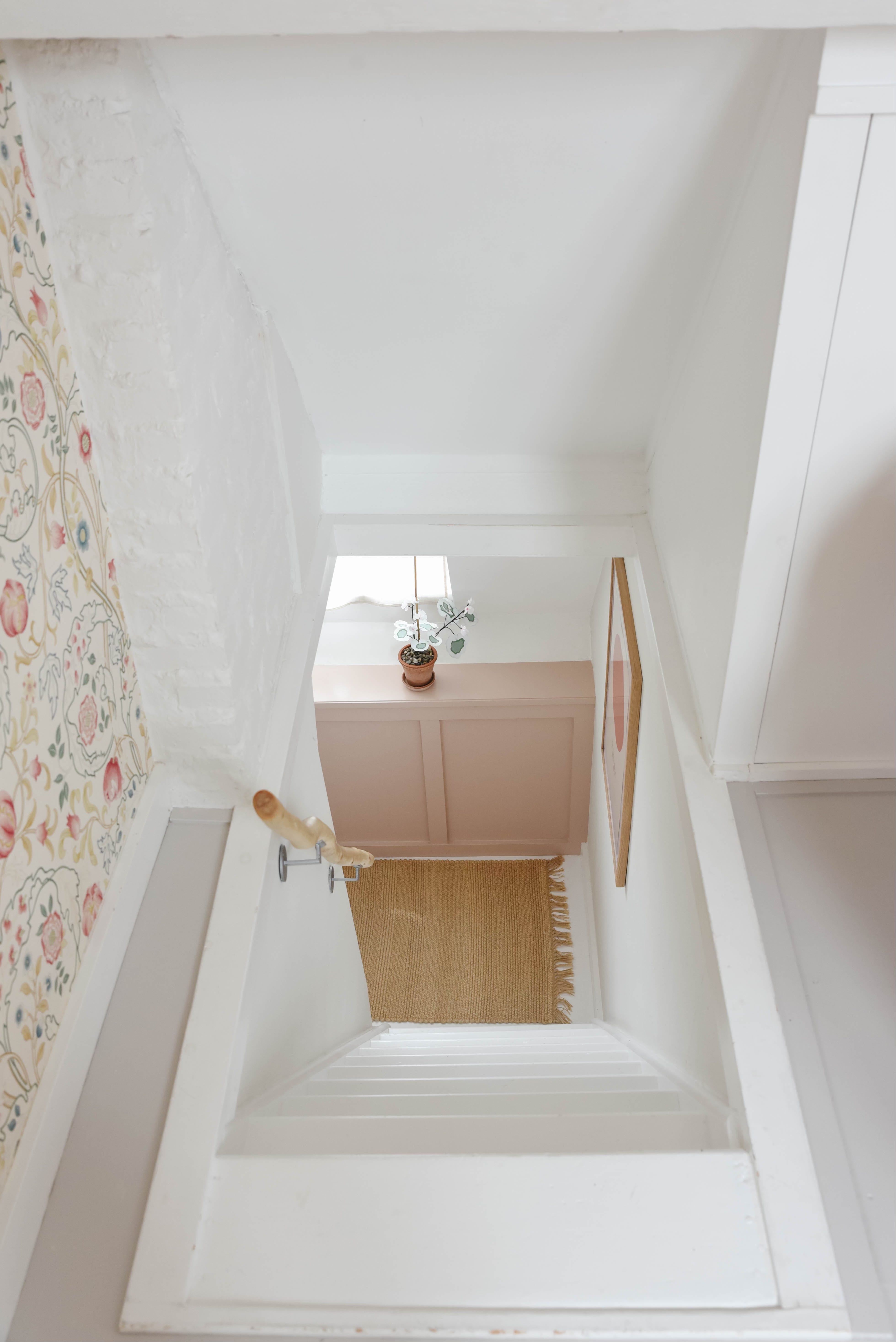
I personally love this view. We’ve used a stripped birch tree branch as a banister, we’ve mixed all sorts of Farrow & Ball paint colours here. Cornforth White for the floors, Setting Plaster for the paneling and windowsill, All White on the stairs and Strong White on the walls - oh how I love all shades of white.


Please visit Bo’s website if you want to see more of Bo’s paintings, or if you want to inquire about a portrait commission. borisvandegrint.com
Love, Yvonne